Cyral Design Style Guide
Establishing design consistency across Material UI components

Project Overview
Duration
4 months
Team
Lead Designer (me), 2 Front-end Engineers, VP of Engineering
Platform
Web Application & Design Tools
The Challenge
As Cyral's first design hire, I inherited a product with significant design inconsistencies that were impacting both engineering velocity and user experience. My initial exposure came during a 2-month contracting period working on a specific feature, which gave me deep familiarity with the product's design shortcomings before joining full-time.
During this time, I found typography font choices and text sizing varied throughout the product. Color usage beyond the primary blue was inconsistent, with subtle hex value variations that looked similar but were technically different. Spacing between visual elements lacked standardization, and buttons and text boxes had visual differences in border radius, creating a mix of circular and rectangular elements. The lack of a standardized design language not only created visual inconsistencies in the user experience, but also created substantial friction for engineering workflows and team growth.
- •Engineering Impact:The front-end team was spending considerable time converting low-fidelity wireframes from Google Slides into usable experiences. In the fast-paced startup environment, functionality was prioritized over form, leaving stylistic decisions to engineers who lacked design guidelines. Each engineer made individual styling choices without communication or standards, and engineers were hesitant to create reusable components without solid experience in usability and accessibility guidelines.
- •Onboarding Friction:New team members faced an intimidating and overwhelming experience with no visual design guidelines. One front-end engineer hired before the style guide struggled significantly, constantly asking which styles to use for new features. In contrast, two engineers hired after implementing the style guide had much smoother onboarding experiences.
My Approach
Strategic Prioritization
Rather than stopping feature development for systematic cleanup, I implemented a pragmatic approach: defining critical styles (spacing, typography, buttons, inputs) and implementing them into new features while allowing existing inconsistencies to remain until refactoring opportunities arose. I took personal responsibility to find time around existing development cycles when initial executive buy-in was limited.
Foundation-First Development
I established foundational styles and high-use components (buttons, tables, iconography from Material UI, cards) as the initial framework. Working closely with the VP of Engineering and participating in CEO and systems architect meetings, I ensured alignment between style guide development and business priorities. The timing worked in our favor—I created the style guide during a period where our team was refactoring critical features, allowing us to clean up popular product areas early.
Material UI Decisions
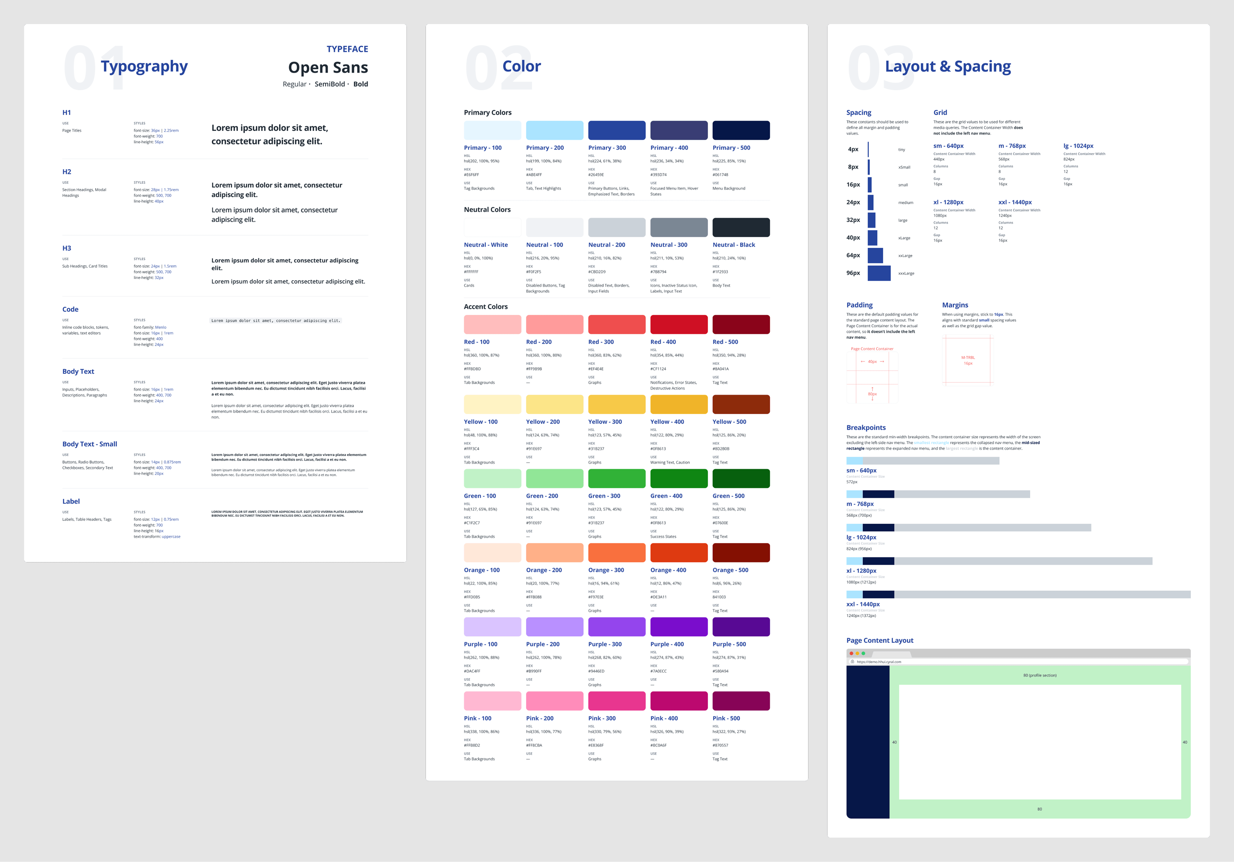
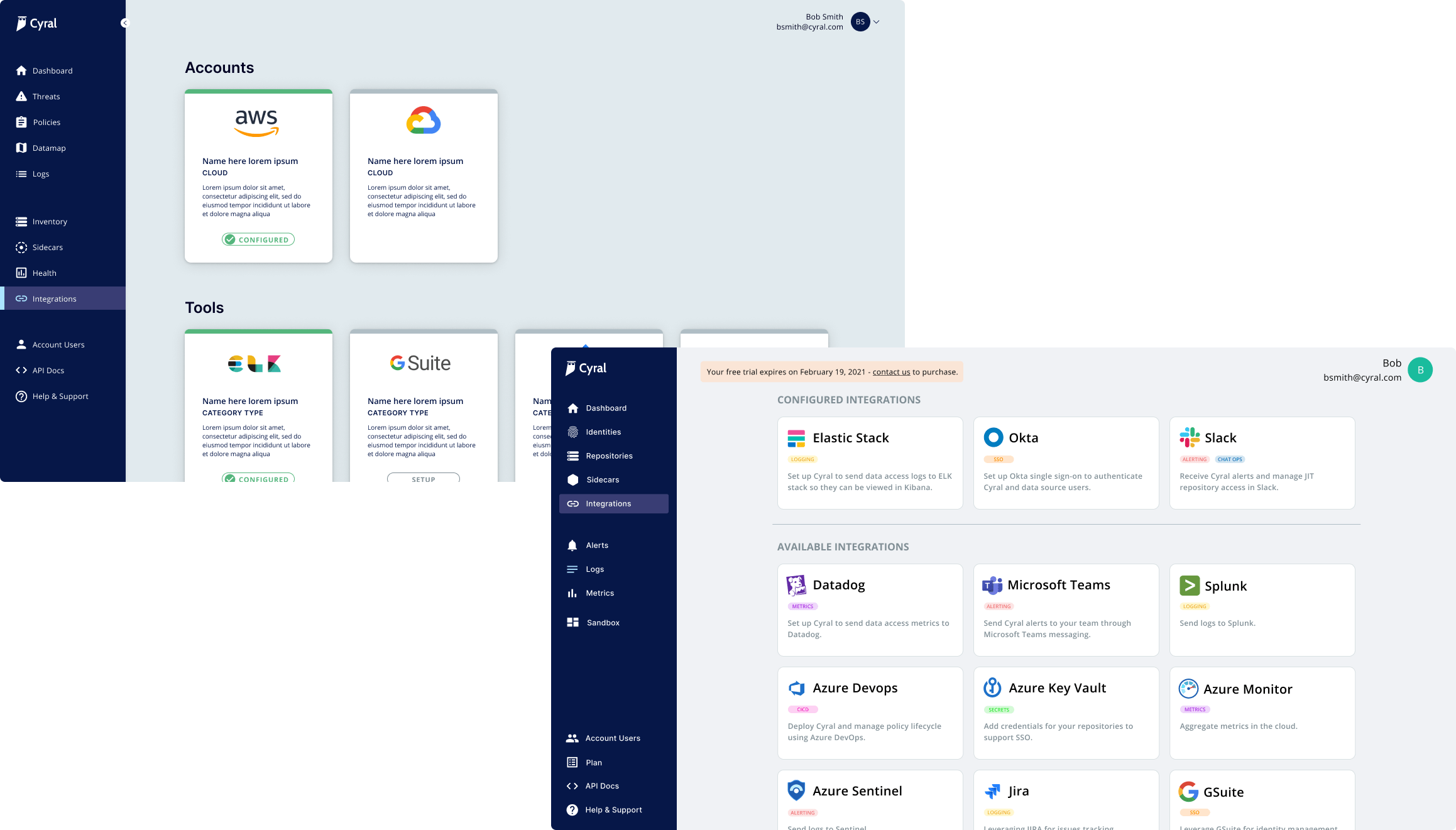
Given reign over visual direction, I made strategic decisions about customizing Material UI components while balancing Cyral's enterprise security brand identity with established usability patterns. Cyral's enterprise security focus required a more professional, trustworthy aesthetic than Material UI's default styling. We customized the primary blue to be deeper and more authoritative, and increased border radius on buttons for a softer interface while maintaining professionalism. Material UI's default data tables weren't suitable for displaying complex database connection information, so we heavily customized them, but we kept Material UI's form validation patterns unchanged because they already met accessibility standards.
Documentation & Organization
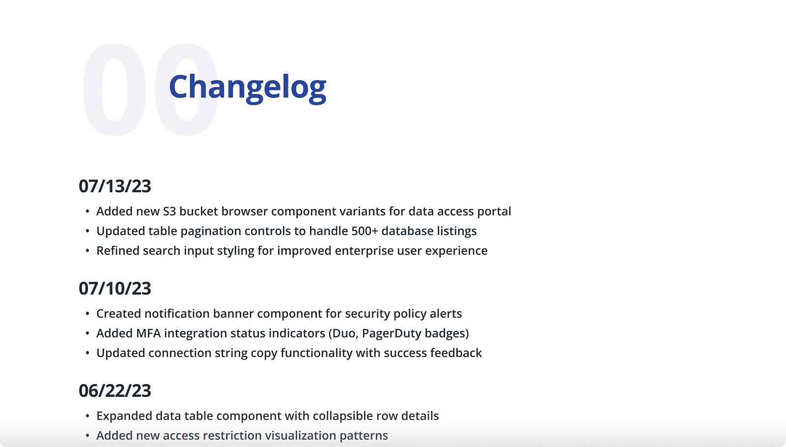
I structured the complete style guide in Figma with individual pages for different categories (typography, shadows, colors, border styles, components, icons) plus a changelog page. This enabled component instances to propagate updates automatically across projects. I worked closely with front-end leads to ensure the team stayed informed of changes through the changelog and detailed Slack communications—pragmatic solutions that worked for our small 3-4 person front-end team.
Technical Collaboration
Close collaboration with engineering leads involved converting design decisions into developer-friendly formats (rem values, hex codes, pixel ranges) and walking through product pages to identify critical components for reusable development. We established practices for creating reusable components that became an ongoing discussion based on component usage frequency.
Impact
- •Measurable Improvements:While lacking formal quantitative metrics, the engineering team consistently reported that the style guide reduced development time by days for various features. Documentation quality improved dramatically, moving from Google Slides screenshots to professional Figma workflows with detailed comments and component references. The shift in workflow enabled increased breadth, depth, and quality of documentation between design and engineering.
- •System Maturity & Sustainability:The style guide evolved significantly during my tenure, with foundational styles remaining stable even after my departure. The component library expanded substantially, and documentation became more refined as component usage patterns clarified through real-world application. The system's persistence and continued growth after I left demonstrates that we built sustainable foundations rather than designer-dependent processes.
- •Onboarding Impact:The contrast between pre- and post-style guide developer onboarding experiences provided clear evidence of impact. New hires could reference exact components and wireframes instead of asking colleagues which styles to follow, making the onboarding experience much smoother and less intimidating.
- •Long-term Evolution:Eventually, we reached a steady state where the development team could utilize best practices and create new features with established components and styles without requiring refactoring work. Component usage became clear based on context, and the mature system enabled the team to work more efficiently and consistently.
Key Takeaways
Strategic Foundation Building
Learning to balance immediate feature needs with long-term systematic improvements taught me how to advocate for foundational work in fast-paced environments while finding pragmatic implementation paths.
Cross-functional Collaboration
Building consensus between design standards and engineering workflows required deep technical understanding and collaborative problem-solving, including translating design decisions into formats engineers could easily implement.
Pragmatic Implementation
Working within startup constraints showed me how to create meaningful improvements without perfect processes, focusing on solutions that work for the team and context rather than ideal scenarios. Sometimes the right answer is "good enough for now" with a plan to improve over time.